
Table of Contents:
Last Updated on October 17, 2025
Are you drowning in data from different systems but struggling to make sense of it all?
In this guide, I’ll share the best SharePoint reporting dashboards that can unify your business data for faster, smarter decisions.
Let’s get started.
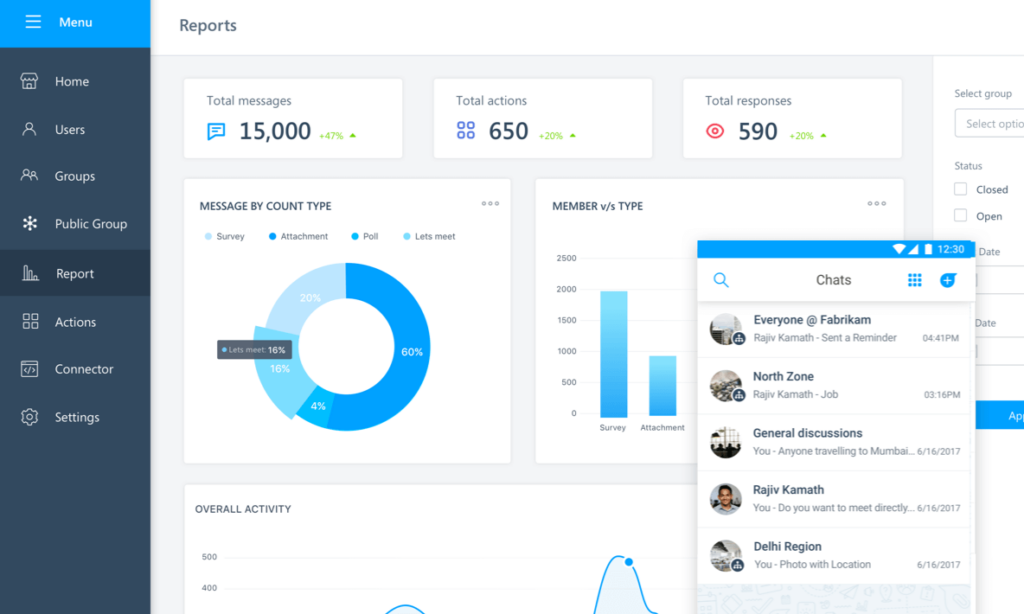
A SharePoint reporting dashboard is a web-based page that pulls data from multiple sources into one place (like a business command center).
It shows your most important metrics on a single screen so you don’t have to jump between different apps.
These dashboards started as simple pages with basic charts back in SharePoint 2010.
As modern business intelligence tools, they connect to various systems like CRM, accounting, marketing, and databases to pull data.
The goal is simple: give you the information you need to make decisions fast. No more waiting for Excel reports.
Sign up for exclusive updates, tips, and strategies
SharePoint dashboards solve real business problems that affect your bottom line. They transform how your team works with data every single day.
Here’s what happens when you implement a well-designed dashboard:
- Faster decisions: Real-time data lets you spot problems and opportunities as they happen
- Better collaboration: Everyone works from the same numbers, eliminating data disputes
- Time savings: Automation replaces hours of manual report building each week
- Deeper insights: Combining data from multiple systems reveals patterns you’d otherwise miss
- Higher accountability: Visible performance metrics motivate teams and track progress
The cost savings alone often justify the investment. Most teams save 10–20 hours per week that they previously spent compiling reports manually.
When you calculate what that time is worth, the ROI becomes obvious fast. Traditional monthly reports are too slow for modern business.
By the time you see last month’s numbers, the market has already moved. Dashboards give you the speed you need to stay competitive.
Microsoft offers several built-in options for creating dashboards without buying third-party tools:
Quick Chart and Basic Web Parts
Quick Chart is the simplest way to visualize SharePoint data. It’s perfect for small teams that need basic charts without any technical setup.
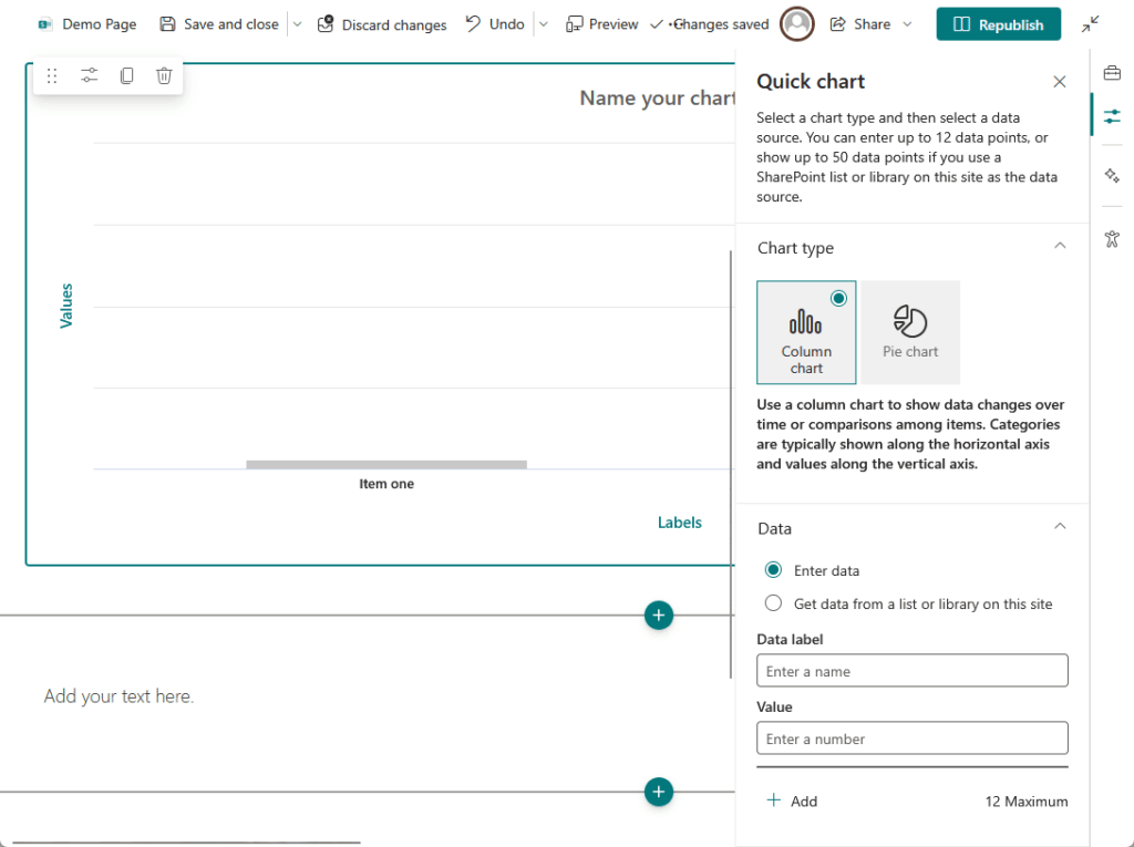
Here’s what you can do with Quick Chart:
- Create bar charts and pie charts from SharePoint list data
- Customize colors and labels without coding
- Display results directly on any SharePoint page
- Set up a simple dashboard in under 10 minutes
The main limitation is that it only works with data stored in SharePoint lists. You can’t connect it to your CRM, accounting system, or other external platforms.
Quick Chart is suitable for department-level tracking, like sales by region or tasks by status, but not for enterprise-wide analytics.
Power BI Integration (The Power Player)
Power BI is Microsoft’s recommended approach for serious business intelligence. This is where you go when you need real power and flexibility.

Key capabilities that make Power BI stand out:
- Connects to hundreds of data sources including CRMs, databases, and cloud apps
- Creates interactive dashboards with filters, drill-downs, and slicers
- Updates data automatically on schedules you set
- Works seamlessly on desktop and mobile devices
- Embeds directly into SharePoint pages with one click
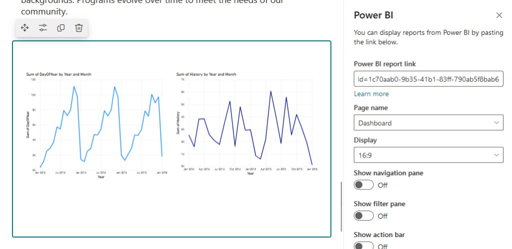
You build your reports in Power BI Desktop, then publish them to the cloud. From there, you can embed them on any SharePoint page using the Power BI web part.
The security is solid:
Users need permission to both the SharePoint page and the Power BI report. This prevents unauthorized access to sensitive business data.
The main challenge is the learning curve with DAX, Power BI’s formula language. But for organizations already using Microsoft 365, this is the most powerful option.
You’re maximizing your existing investment instead of paying for another tool. Most teams find the learning curve worth it for the capabilities they gain.
Viva Connections Dashboard
Viva Connections is Microsoft’s modern approach to the company intranet. It delivers a personalized experience that looks more like a mobile app than a traditional website.
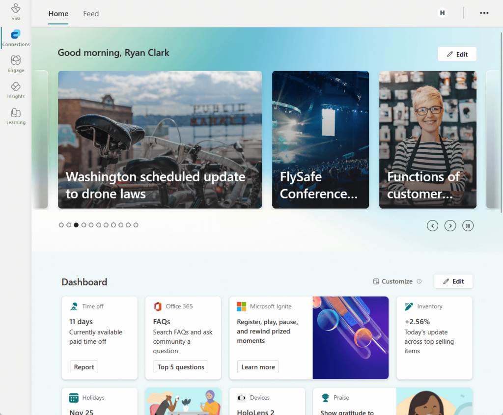
What makes Viva Connections different:
- Card-based design that’s clean and easy to navigate
- Personalizes content based on each user’s role automatically
- Integrates with SharePoint, Power BI, Teams, and other M365 apps
- Delivers targeted news and announcements to specific groups
- Works identically on desktop and mobile
A sales rep sees their personal quota, while a manager sees team performance. This personalization happens automatically using Microsoft 365 Groups.
It’s the best choice if you want a consumer-grade experience for your employees. The modern interface drives higher engagement than traditional SharePoint pages.
Top Third-Party Dashboard Tools
Sometimes the native Microsoft tools don’t fit your specific needs. You might need specialized features, better visualizations, or already use a different analytics platform.
Here’s how the leading options compare at a glance:
| Tool | Best For | Starting Price | Key Strength | SharePoint Connection |
| Power BI | Microsoft 365 users | $120/user/year | Deep M365 integration | Native connectors |
| Tableau | Data analysts | $900/user/year | Best-in-class visualizations | Extract only (not live) |
| Domo | Large enterprises | $30K-$100K/year | Cloud-native, AI features | Dedicated connector |
| Sisense | Software vendors | $25K-$40K/year | Embedded analytics | JDBC driver |
| Klipfolio | SMBs, marketing | ~$1,440/year | User-friendly, marketing focus | API queries |
Each platform brings something unique to the table. Let’s look at when each one makes the most sense for your business.
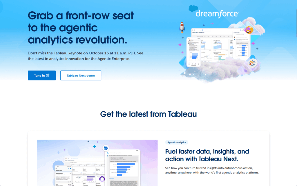
1. Tableau
Tableau has been the gold standard for data visualization for years. Its drag-and-drop interface makes creating complex, beautiful charts surprisingly easy.
Top features that set Tableau apart:
- Industry-leading visualization library with advanced chart types
- Intuitive interface that doesn’t require coding knowledge
- Large community with extensive training resources
- Powerful calculated fields for custom metrics
- Strong performance with large datasets
It connects to SharePoint Lists using a dedicated connector. The main limitation is that it only supports data extracts, not live connections.
This means your Tableau dashboards won’t update in real time from SharePoint. Tableau works best for organizations with dedicated data analysts on staff.
The per-user cost starts around $900 per year for a Creator license. That’s significantly more expensive than Power BI Pro at $120 per year.
If visualization quality is your top priority, Tableau is worth the investment. Many organizations use it specifically for executive presentations and public-facing reports.
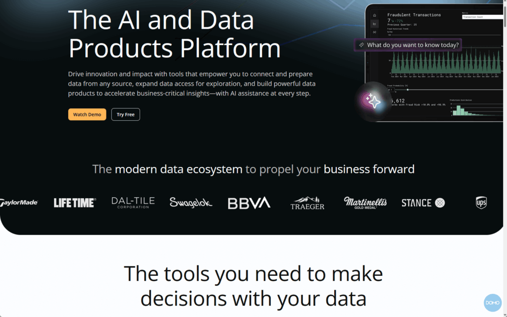
2. Domo
Domo is a cloud-native platform built from the ground up for connecting diverse data sources. It excels at pulling data from hundreds of different systems into one unified view.
What makes Domo powerful:
- Pre-built connectors for 1,000+ data sources
- Real-time collaboration with commenting on dashboards
- AI-powered insights that surface trends automatically
- Mobile-first design with excellent smartphone experience
- Strong data governance and access controls
The SharePoint connector works with lists and libraries, seamlessly blending SharePoint data with CRM, marketing, and financial systems.
The main issue is the pricing model. Domo uses a credit-based system that’s hard to predict and can get expensive fast.
Annual contracts typically range from $30,000 to over $100,000. This puts it firmly in the large enterprise category.
Domo excels at unifying data from diverse non-Microsoft systems, offering platform-agnostic, enterprise-grade features.
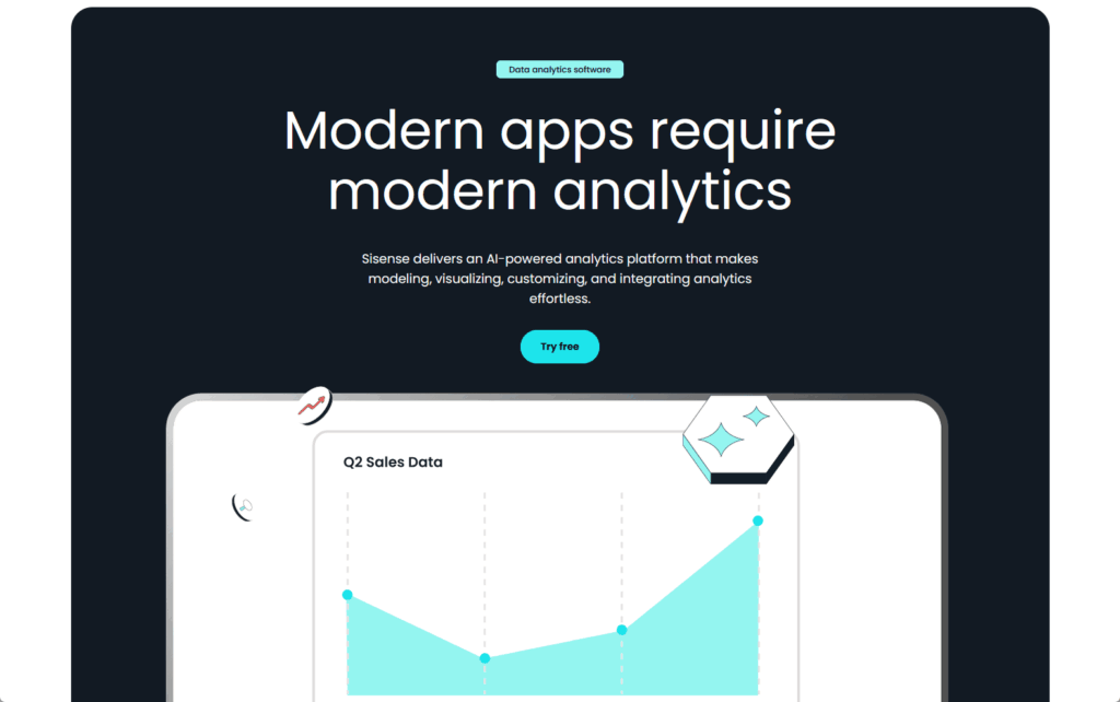
3. Sisense
Sisense focuses on embedded analytics and AI-driven insights. It’s designed for organizations that need sophisticated analytics woven into their workflows.
Key capabilities that make Sisense unique:
- Natural language queries (type questions, get instant charts)
- Powerful embedded analytics for custom applications
- AI-driven insights that highlight anomalies
- White-label options for branding customization
- ElastiCube technology for fast data processing
It connects to SharePoint via a JDBC driver, importing data into its data engine. This enables powerful data modeling and transformation.
Sisense is ideal for software companies embedding analytics, with enterprise pricing starting at $25,000-$40,000 annually.
Sisense is a solid investment for advanced embedded analytics. The natural language querying feature also makes it accessible to non-technical users.
4. Klipfolio
Klipfolio is designed specifically for small and medium-sized businesses. It prioritizes ease of use without requiring deep technical expertise.
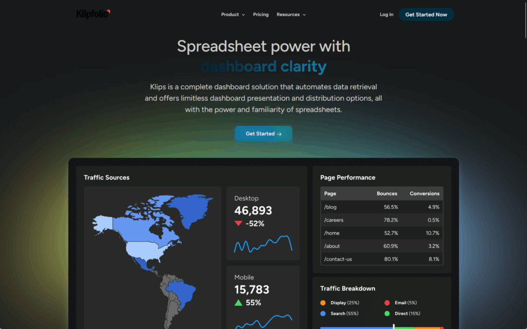
Features that make Klipfolio accessible:
- Pre-built templates for common business metrics
- Connector Gallery for easy multi-source setup
- Simple drag-and-drop dashboard builder
- Strong focus on marketing and social media data
- Affordable pricing for smaller teams
It connects to SharePoint through API queries and OneDrive integration. You can blend SharePoint data with Google Analytics, social media, and email marketing.
This makes it popular with marketing agencies and digital marketing teams. The base plan starts around $1,440 per year, which is affordable for SMBs.
The trade-off is fewer enterprise features like advanced governance and complex data modeling. In short, it’s a simpler alternative to Power BI.
How to Choose the Right Dashboard for Your Team
Dashboard tool selection should align with your organization’s technology, team skills, and business goals, making it a strategic decision.
Start with Your Current Tech Stack
Your existing technology investments should guide your decision. Don’t ignore what you already own and pay for.
Consider these factors when evaluating your tech stack:
- Microsoft 365 licensing: Power BI may already be included
- Existing BI tools: Switching costs money and disrupts workflows
- IT expertise: Match tool complexity to your team’s skills
- Integration needs: Some tools play better with certain platforms
If you’re already using Microsoft 365, Power BI is the obvious starting point. It’s deeply integrated with SharePoint, Teams, and Excel.
Microsoft offers extensive learning and support. For organizations using diverse platforms, a platform-agnostic tool is more suitable.
Budget matters too: bundled Microsoft licenses cost less than adding separate BI tools. Calculate the total cost including licenses, training, and administration time.
Match the Tool to Your Users
Different people need different levels of detail and interactivity. Your dashboard design should match how people actually work.
Here’s what different user types need:
- Executives: High-level KPIs, mobile access, red-yellow-green indicators
- Managers: Drill-down capability, filters by team or project, comparison views
- Analysts: Raw data access, custom calculations, export capabilities
- Frontline staff: Personal metrics, simple views, action-oriented information
SharePoint’s audience targeting displays different dashboard views to different groups, allowing one page to serve multiple audiences automatically.
Sales reps view personal quotas; managers see team performance. Personalization relies on Microsoft 365 Group membership.
Consider Your Data Sources
Make a list of every system that holds data you need to visualize. The breadth of your data landscape matters more than you might think.
Your data source checklist should include:
- CRM systems: Salesforce, Dynamics, HubSpot
- Accounting/ERP: QuickBooks, NetSuite, SAP
- Marketing platforms: Google Analytics, Facebook Ads, Mailchimp
- Databases: SQL Server, MySQL, Oracle
- Industry-specific software: Tools unique to your business
Power BI has strong connectors for Microsoft systems and popular platforms. It also connects to Salesforce, Google Analytics, and most major databases.
Always check connector availability for industry-specific software. Third-party tools often offer more connectors for non-Microsoft systems.
The more diverse your data sources, the more you might need a platform-agnostic solution. Start by mapping your current data landscape before evaluating tools.
Real-World Dashboard Use Cases
Dashboards work across every department in your organization. Here are the most common use cases that deliver immediate ROI:
Sales Performance Tracking
Sales dashboards turn your CRM data into actionable insights. They give your team the visibility they need to hit their numbers.
What to include in a sales dashboard:
- Pipeline value by stage (prospecting, qualification, proposal, closing)
- Individual and team quota attainment with progress bars
- Conversion rates between pipeline stages
- Revenue trends over time with forecasts
- Top deals and at-risk opportunities
Individual reps can track their progress toward monthly and quarterly quotas in real time. Managers monitor conversion rates to identify bottlenecks.
The dashboard might show that deals move quickly from qualification to proposal but stall at the proposal stage. Focus coaching and process improvements there.
When everyone sees the same numbers, there’s no debate about performance. Sales teams are more motivated by daily progress updates.
Project Management
Project dashboards give teams a shared view of progress and health. They eliminate the confusion that comes from scattered status updates.
Essential elements for project dashboards:
- Task completion rates with visual progress bars
- Budget tracking (actual vs. planned spending)
- Timeline views with upcoming milestones
- Red-amber-green (RAG) status indicators for overall health
- Team capacity and resource allocation
Task completion rates show how much work is done versus what’s planned. Budget tracking compares actual spending against the approved budget.
Timeline views highlight upcoming milestones and deadlines so nothing falls through the cracks. Shared information eliminates priority confusion.
Team members know exactly what needs attention and when. Project managers spend less time in status meetings because the dashboard answers most questions.
HR Analytics
HR dashboards transform people data from administrative records into strategic insights. They facilitate better decisions about your most valuable asset: your people.
Key metrics for HR dashboards:
- Headcount and turnover rates by department
- Recruitment funnel (applicants, interviews, offers, hires)
- Time-to-hire and cost-per-hire metrics
- Employee engagement scores from surveys
- Diversity and inclusion metrics
Turnover metrics help you plan hiring and retention strategies proactively. The recruitment funnel shows how many candidates are at each stage of the hiring process.
Time-to-hire metrics help you optimize your recruiting and identify bottlenecks. Employee engagement scores from surveys can predict turnover before it happens.
This gives you time to intervene and retain valuable employees. HR moves from reactive record-keeping to strategic workforce planning.
AI is turning dashboards into active analysts. Microsoft’s new AI-powered insights feature automatically analyzes reports, flagging potential issues.
Instead of you looking for problems, the AI suggests fixes and highlights anomalies. Copilot will enable conversational analytics where you ask questions in plain English.
Type “show me our top underperforming products” and get an instant answer with charts. Admins are moving from manual tasks to managing smart, automated systems.
Do you have questions about SharePoint dashboards or need help choosing the right tool? Let me know.
For any business-related queries or concerns, contact me through the contact form. I always reply. 🙂