
Last Updated on April 17, 2025
Want to improve how your users interact with SharePoint?
In this guide, let’s talk about what you can do, step by step, to enhance your users’ SharePoint experience.
Let’s get started.
Table of Contents:
- Does the UX really matter?
- Step 1: Understand What Users Actually Need
- Step 2: Create a Cleaner Information Structure
- Step 3: Customize the Look Without Going Overboard
- Step 4: Make Navigation Easy and Logical
- Step 5: Add Useful Web Parts for Daily Work
- Step 6: Speed Things Up for Everyone
- Step 7: Support Users with Training and Help
- Lastly, Keep It Fresh with User Feedback
Does the UX really matter?
Short answer: yes.
If users can’t find what they need quickly or the site feels clunky to them, they will avoid using it altogether.
That leads to:
- Wasted time
- Missed info
- Frustration
A smooth, intuitive experience helps teams work better and actually want to use the tools they’ve got, so it matters. 🙂
As for what users typically struggle with, watch out for:
- Navigation
- Cluttered or outdated content
- Inconsistent design
- Needing too many clicks
Some users get lost when there are too many clicks just to do something simple, like uploading a doc or checking a task.
And honestly, if there’s no training or guidance, they’re just guessing their way through it.
With that in mind, here’s what I suggest you do:
Sign up for exclusive updates, tips, and strategies
Step 1: Understand What Users Actually Need
Before changing anything, it’s smart to figure out what your users really need (well, guessing can lead to more confusion).
Start with these actions:
- Run surveys or polls
- Hold short interviews or chats
- Create user personas
These steps help you see patterns in behavior and struggles.
For example, some users may only want quick access to reports, while others live in document libraries all day.
You can use Microsoft Forms for it and embed it right into a SharePoint page:
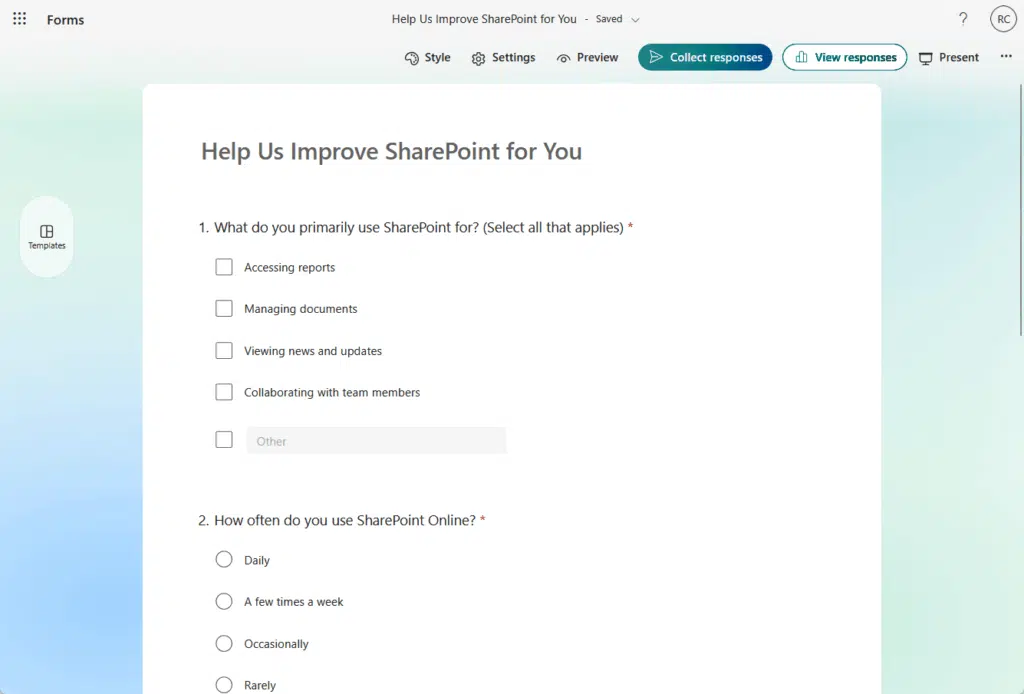
Understanding this makes it easier to design a site that supports real tasks.
When people see that things are built around what they actually do, they’re more likely to use and rely on the site.
Step 2: Create a Cleaner Information Structure
In the first step, you find out what users need, like “I just want quick access to reports” or “I work in document libraries all day.”
So in this step, you use that info to shape your structure, like for example:
- Create a top-level page for key content like reports or tools
- Use simple, consistent folder names based on how users search
- Tag files with metadata like project name or team to filter fast
By the way, no matter what you learn in the first step, these three actions still help (like the baseline cleanup).
Let’s dig a little deeper:
Reorganize site content and pages
Cleaning up makes a big difference as over time, it’s easy for sites to get messy with outdated content or scattered pages.
Here’s how to start:
- Audit existing pages
- Group related content
- Create logical sections
The first two are easy, but let me give you an example of how to create logical sections.
Let’s say you’re setting up a SharePoint site for a marketing team – here’s how you could break things into logical sections:
- Campaigns – pages for current or past campaigns, including assets and timelines
- Templates and guidelines – brand kits, email templates, social media standards
- Reports and analytics – access to dashboards, monthly performance data
- Team resources – think org chart, contact list, meeting notes, FAQs
Each of these becomes its own section or page, with links to related documents or tools.
Anyway, reorganizing your site is like organizing a kitchen: if your tools and ingredients are all over, cooking is frustrating.
Similarly, group things by task or role, and use hubs or section pages to guide people, so they don’t need to click around blindly.
Keep it focused, and users won’t have to guess where to go.
Use clear, consistent naming and folders
If your naming is all over the place, users get confused fast.
A folder called “Marketing2023” next to one called “Q1_MKT_Assets” just makes people guess, and that leads to mistakes.
Here’s what helps:
- Set naming rules
- Use plain language
- Keep folder depth shallow
Consistency is what builds trust in your structure: when people know exactly what to expect from a name or folder, they move faster.
You don’t need to go full spreadsheet-mode 😅 just be clear, stay uniform, and make names work for everyone.
By the way, I deem naming conventions really important, so I created a separate guide for their best practices and guidelines. 🙂
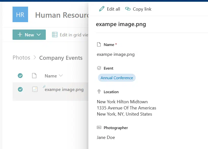
Add metadata and filters for faster search
Metadata is like giving your files helpful labels, so users can find stuff without hunting through folders, making SharePoint faster to use.
Here’s what to do:
- Add key metadata
- Use custom columns
- Create filtered views
Instead of digging through folders, users can click one filter and see just what they need, making it feel faster and cleaner.
The gem here is when you combine metadata and filtered views (which show a custom slice of a document library or list)
For example, instead of showing all files, a view can show:
- Only documents from a certain team
- Files created in the last 30 days
- Items with a status of “In Progress”
You can also set it as the default view or let users switch between views as needed.
The bottom line is that filtered views turn SharePoint from a content dump into a focused workspace, and that’s a win.
Step 3: Customize the Look Without Going Overboard
Design matters, but you don’t need to go wild with it: a clean, modern site feels better to use, and people trust it more.
But too much color, clutter, or widgets? That just distracts. 🙁
Here’s what I suggest:
- Apply a clean theme
- Use a simple homepage layout
- Make sure it’s mobile-friendly
Stick to modern pages and avoid overloading with too many web parts, and keep the spacing clean with some breathing room.
By the way, there are recent updates in applying a design to a site, so let me discuss this for a bit.
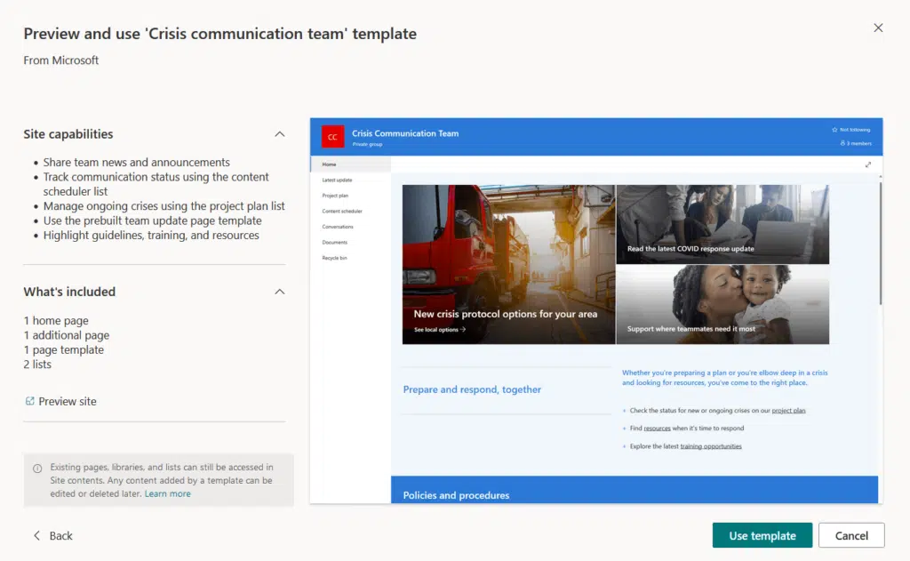
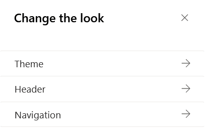
Currently, there are 3 options for designing a site:
- Applying a site template
- Through the “Change the Look” feature
- Site Branding (New)
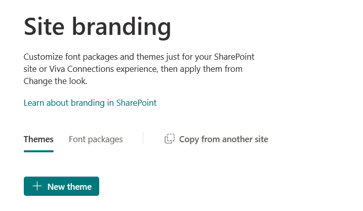
The least familiar to you is probably site branding.
Basically, it introduces advanced customization options, like the ability to create custom font packages and themes.
It’s practically a tool you can use to create your own theme:
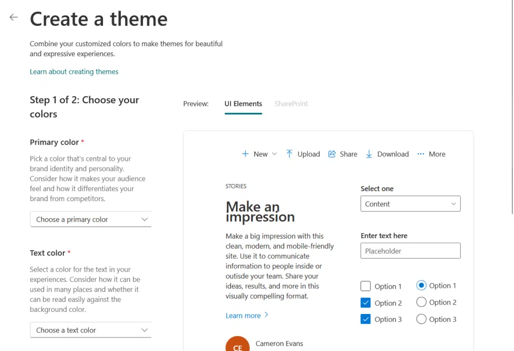
This centralized approach ensures consistency across multiple sites and simplifies the branding process.
I feel you can combine all three options like this:
- Start with a template to lessen your work
- Configure the look of the theme, header, and navigation
- Use the site branding tool if you’re not satisfied with the preset themes
Remember that a well-rounded design supports both the user experience and your organization’s identity.
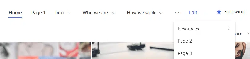
Good navigation keeps users moving, not guessing.
If they can’t find what they need in a few clicks, they will bounce or ask someone instead, which is why a clear structure is important.
Picture this:
How would you feel navigating through a navigation that’s not remotely helpful, with 15+ links, vague titles, and deep nesting?
That gets messy fast, and users will either get lost or just give up, so here’s how to improve the navigation:
- Keep it simple
- Maintain a consistent layout
- Use audience targeting
- Limit levels
Users should feel like they know where things are, even if they’re visiting a page for the first time.
Navigation isn’t just about structure; it’s about clarity and comfort, and when done right, people stop thinking about it.
I wrote another article about navigation tips, so make sure to check it out if you want to improve your site’s navigation.
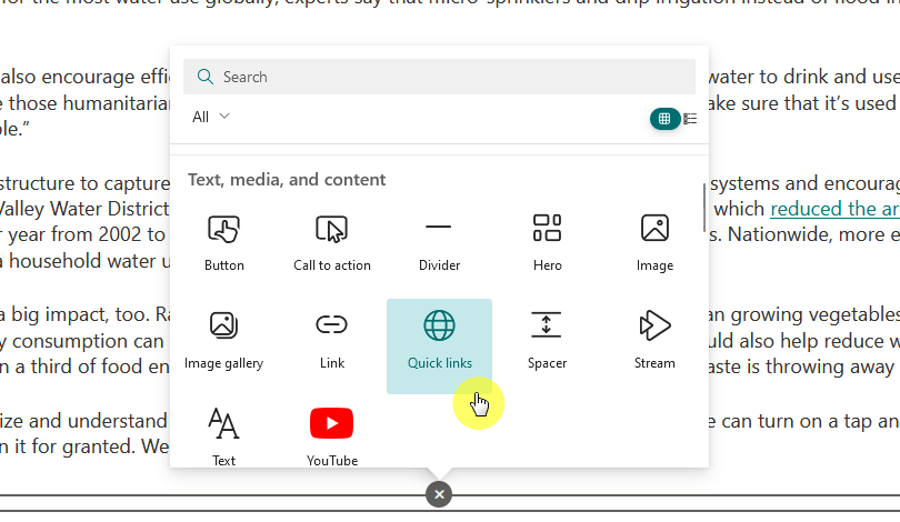
Step 5: Add Useful Web Parts for Daily Work
Web parts are the building blocks of SharePoint pages, and they can make or break how helpful a site feels.
Here are examples of useful web parts you can use:
- Quick links
- Document library
- Calendar
- News
- List
I like these web parts as they cover most team needs, such as access to information, staying organized, and sharing updates.
However, don’t go overboard and stick to what supports real, daily work.
For example, a team might need a web part that shows upcoming meetings, while another needs a list of project documents.
Pick what’s useful, not just flashy, as a few well-placed web parts can turn a basic page into a real productivity tool.
Step 6: Speed Things Up for Everyone
A slow SharePoint site is a dealbreaker.
Speed isn’t just a nice-to-have as if pages take forever to load, users lose interest and trust, shaping how people feel about using the site.
Here’s how to keep things fast:
- Simplify page design and reduce web parts
- Use Content Delivery Networks (CDNs)
- Compress and optimize images
- Minify and bundle CSS and JavaScript files
Even modern SharePoint pages can slow down if overloaded with media or clutter, so stick to clean layouts and optimized assets.
SharePoint Online has list view thresholds, and they can affect performance and usability if you’re not careful.
The list view threshold is 5,000 items, and once you go beyond this, you will experience issues that are page-breaking.
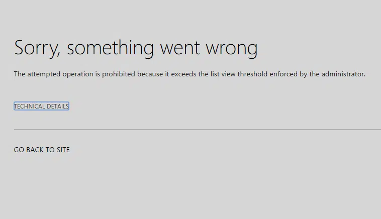
The workaround for this is to:
- Use filters and indexed columns
- Break large libraries into folders or sub-libraries
- Create custom views
This ties to this step because performance isn’t just about how fast a page loads, it’s also about whether it loads at all.
Step 7: Support Users with Training and Help
Even the best-designed SharePoint site needs some backup.
Not everyone’s a power user, and if people feel stuck, they will either give up or flood your inbox with questions. 😅
That’s where support and training come in:
- Share quick-start guides or walkthroughs
- Offer short video tutorials or live sessions
- Create a help hub
Support doesn’t have to be fancy, it just needs to be clear and easy to find.
A 2-minute video showing how to upload files or a one-pager on using filters can save tons of time and questions.
The more confident users feel, the more they will use the site the right way.
Lastly, Keep It Fresh with User Feedback
Once your site is up and running, don’t let it sit and gather dust; what worked great last month might not work today.
I suggest you:
- Add a feedback form or poll
- Use site analytics
- Tweak based on feedback
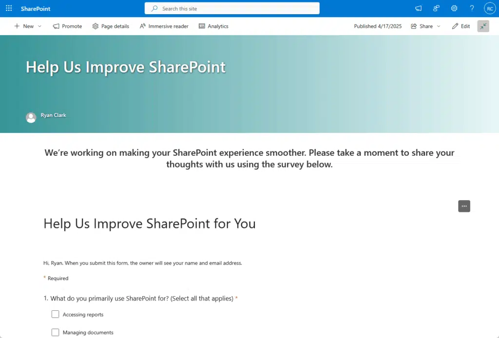
You can create another survey using Microsoft Forms and send it out to users to collect feedback about the improvement.
Remember that your users are the ones in the site every day, they will spot things you won’t, so list and adjust regularly.
Do you have any questions about enhancing the user experience in your SharePoint? Let me know.
For any business-related queries or concerns, contact me through the contact form. I always reply. 🙂


