
Table of Contents:
91% of organizations have an intranet. Only 13% of employees use it daily. 31% never touch it. I’ve built these homepages across industries.
The patterns are always the same:
- A homepage nobody checks anymore because nothing on it ever changes
- Navigation organized around the org chart, not around how people actually work
The gap between “we built an intranet” and “employees actually use our intranet” is almost always the homepage. It’s where adoption lives or dies.
The good news? This is fixable. It starts by understanding what each component of your homepage actually does.
Why Most Intranet Homepages Fail
Here’s what separates the winners from everyone else: high-performing SharePoint intranets see 87% unique visits monthly.
The low performers? Less than 45%.
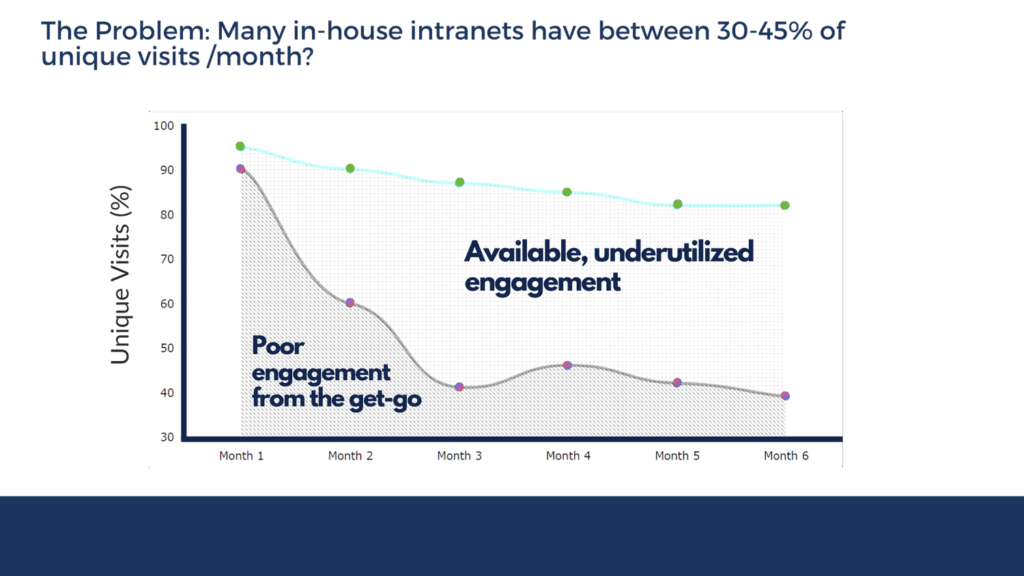
Source: https://www.origamiconnect.com/intranet-engagement-study
Structure is the differentiator. Full stop.
The root causes are always the same:
- Navigation organized by org chart instead of daily tasks
- Stale content (the number one adoption killer)
- Search that doesn’t work
- No personalization
Here’s what Content Formula’s research shows, and it’s crucial. If your homepage works, employees explore deeper into your intranet.
If it fails, nothing else matters.
You could have a perfect HR portal and an immaculate document center, but if the front door doesn’t work, most people never step through.
Sign up for exclusive updates, tips, and strategies
The Components at a Glance
Every effective intranet homepage has seven core parts. Think of them as an anatomy.
| Component | UX Role | Key SharePoint Feature |
|---|---|---|
| Navigation | Task-oriented wayfinding | Mega menu, hub sites, audience targeting |
| Search | Discoverability across content | Bookmarks, result types, search verticals |
| Hero Section | Trust signal and freshness indicator | News web part, audience-targeted hero |
| News and Announcements | Return-visit driver | Boosted news, highlighted posts, targeting |
| Quick Links | One-click access to daily destinations | Targeted quick link web parts |
| Personalization | Visibility by role, department, or audience | Audience targeting across all elements |
| Supporting Elements | Accessibility, feedback, mobile | Footer, people directory, responsive design |
Remove one, and the whole system underperforms.
Navigation is where most intranets get the anatomy wrong.
Nielsen Norman Group tested 57 intranets and found a clear winner: task-oriented navigation beats org-chart navigation every single time.
Employees don’t think “I need to find something in Finance.” They think “I need to expense a receipt” or “I need to find the travel policy.”
When navigation’s organized by department or corporate structure, you’re forcing them to guess.
Here’s the fix: a mega menu with a maximum of seven top-level categories, each with action-oriented labels.
| Instead of this | Use this |
|---|---|
| Human Resources | Hiring, Benefits, Pay, Learning, Culture, Policies |
| Information Technology | Get Tech Help, Software, Accounts, Security, Networks |
Hub sites layer on top of this. They let you create cross-site navigation without flattening everything into one massive menu.

Source: https://adoption.microsoft.com/sharepoint-look-book
A project team has its own hub. A regional office has its own hub.
The main intranet hub provides the skeleton; hub sites add context-specific wayfinding.
Audit your current navigation in SharePoint against this:
- Can an employee find their most-used destination in three clicks or fewer?
- Is your top-level menu reflecting how people work, or how your org chart is structured?
- Are you relying on people remembering exact site names?
What great navigation looks like:
- Task-oriented top-level categories tied to employee workflows
- Mega menu with clear subcategories under each item
- Hub sites for projects, regions, or departments needing scoped navigation
- Audience-targeted nav items (so frontline workers don’t see corporate-only links)
- Responsive mobile menu with larger touch targets
Patterns to avoid:
- Top-level categories mirroring the org chart
- More than seven top-level menu items
- Cryptic labels (“ATS Portal,” “ESS,” “SOM”)
- Sub-navigation nested more than two levels deep
- No targeting by role or department
If you’re scoring less than five of these, your navigation is costing you adoption. Start there.
Search: The Nervous System
Search is the most underestimated component on any intranet. Most organizations treat it as an afterthought.
“We have SharePoint, so we have search” is the typical assumption. That’s backwards: search configuration matters more than navigation depth.
A well-configured search with bookmarks, result types, and search verticals will outperform a perfectly architected IA with broken search, and I’ve seen it happen.
Here’s what that looks like in practice:
- Search “travel approval” → 800 results from old SharePoint sites, OneNote pages, and Teams. Top result is from 2019. Employees give up and email their manager instead.
- Search “request time off” → results from every site mentioning “time” or “off,” plus People results for names like “Offdense Smith.” Search falls apart.
When search results are consistently irrelevant, employees give up and ask a colleague instead. That’s the pattern the NNG intranet research documents repeatedly across 57 organizations.
SharePoint search configuration means:
- Creating bookmarks for the most-searched terms (travel, expenses, benefits, passwords) that link straight to the answer
- Building result types that surface different content types differently, so a policy looks different from a form, which looks different from a contact
- Setting up search verticals so people can search “Files” separately from “News” separately from “People”
- Configuring the people directory so “john smith it manager” finds the right John
Common search configuration mistakes:
- No bookmarks, forcing users to hunt through organic results
- Search result types all formatted identically (policy looks like form looks like FAQ)
- No search verticals; all content dumped into one result set
- Crawl settings that index outdated sites
- Query rules that boost irrelevant content
- People directory search that doesn’t surface job title or department
Fix these and search becomes a trust-builder instead of an adoption killer.
The Hero Section: The Face
Your hero section is the first thing employees see when they land on your homepage. It’s the trust signal.
It can be a banner, a news post with a featured image, or rotating announcements. The format doesn’t matter.
The content does.
Here’s what each type of hero communicates:
| Generic hero | Fresh hero | |
|---|---|---|
| What it looks like | “Welcome to Our Intranet” | “Q2 Planning Kickoff,” “New Office Reopens Tuesday,” “Benefits Open Enrollment Starts May 12” |
| Signal sent | “Nobody has touched this in months” | “This is alive. People here care.” |
| Employee response | “This tool is dead.” Defaults to email and Teams. | “I should check here for what’s happening.” |
Audience targeting matters here too. If your organization has remote workers and on-site employees, they don’t need to see the same hero.
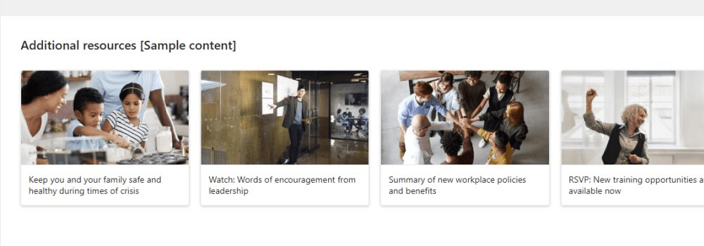
![A website homepage with a white header showing navigation links and a blue logo. Below are photos: a smiling woman, a man and child assembling drones, and a man at a desk. Text: Why customer service is the new marketing [Sample content].](https://www.mrsharepoint.com/wp-content/uploads/2026/05/sharepoint-homepage-hero-section-1024x310.png)
Source: https://adoption.microsoft.com/sharepoint-look-book
The on-site team cares about parking and office space. The remote team cares about upcoming virtual events.
An IT manager cares about system maintenance. A finance analyst cares about budget cycles.
Here’s the mistake I keep seeing: treating the hero as a branding exercise. One generic, rarely-updated announcement broadcast to everyone.
Make it fresh. Make it role-specific. Make it matter.
News and Announcements: The Heartbeat
News is your return-visit driver. Not navigation. Not quick links. News.
Stale content is the number one adoption killer. Employees stop coming back and default to email and Teams because those channels actually have fresh information.
The news web part on your homepage can be configured to highlight specific posts, boost certain authors, and target news by audience.
| Industry | How they configure it |
|---|---|
| Healthcare | Clinical updates for doctors and nurses surface separately from facility announcements |
| Manufacturing | Safety alerts broadcast to everyone; shift schedules targeted by production line |
Boosted news floats important announcements to the top. Highlighted posts pin them and give them visual emphasis.
Source: https://adoption.microsoft.com/sharepoint-look-book
Audience targeting means an HR announcement about open enrollment reaches HR staff but doesn’t clutter the news feed for operations teams.
Here’s what I tell clients. Decide who owns each category: HR for benefits news, Facilities Management for facility updates, Corporate Communications for company announcements.
Give them the tools to publish directly. Don’t bottle-neck everything through one content admin, or your news will lag and your employees will leave.
What great news and announcements looks like:
- Published at least weekly, preferably 2-3 times per week
- Boosted posts for urgent or broad announcements
- Highlighted posts pinned for the current week
- Audience targeting by department, role, or M365 Group
- Clear ownership model with defined publishers
- A feedback mechanism so people can react or comment
Patterns to avoid:
- News older than two weeks
- Everything boosted (loses emphasis)
- No targeting; same news broadcast to everyone
- Cryptic post titles
- Unclear ownership or long approval chains
- No governance on what gets published
Get the ownership model right and the freshness problem solves itself.
Quick Links: The Hands
Your quick links section is the top 8-12 daily-use destinations, above the fold. This is where employees go when they land on the homepage.
Not “Relevant Resources.” Not “Explore Our Content.”
These are the actual tools and forms and documents people use every day:
- Expense reports
- Time off requests
- Password reset
- Benefits enrollment
- Software ordering
- Help desk
Audience targeting is critical here. Not everyone needs the same links:
| Audience | What to leave out |
|---|---|
| IT team | Maternity Leave Policy |
| HR team | Submit a Ticket, Software Catalog |
| International employees | Links scoped to other regions |
Here’s what I’ve noticed: get quick links right and employees engage. Treat them as a content showcase and they bounce to Teams instead.
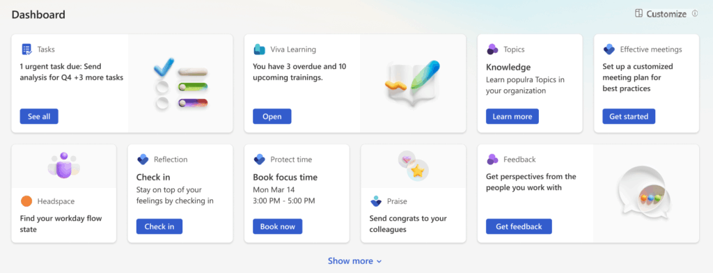
If you’re using Viva Connections in Teams, the dashboard cards are your equivalent. Target them the same way: audience-targeted, organized by role and what people actually use.
Personalization: The Brain
Personalization ties all the other components together. Without it, you’re serving every employee the same homepage.
Audience targeting in SharePoint is a visibility filter, not a security control. This is important.
You can target any element to specific groups and audiences: Microsoft Entra ID groups, M365 Groups, or semantic audiences. It doesn’t lock anyone out.
That distinction matters. Most of your organization doesn’t care about IT security policies or finance budget codes.
Show them what they need. Hide everything else.
Here’s what I configure most often. An organization has 15 distinct audiences:
- Finance team, HR team, and facilities
- Sales, customer success, and IT operations
- IT service desk, managers, and executives
- Remote workers, on-site staff, and contractors
- Partners, interns, and frontline workers
Each group sees a different hero section, different news categories, different quick links, different navigation items.
A field technician doesn’t see corporate announcements. A finance director doesn’t see the IT service catalog. A manager sees team-scoped content that an individual contributor doesn’t.
Source: https://adoption.microsoft.com/en-us/microsoft-365/viva/connections
Viva Connections is built around this. It lets you target experiences by audience: information workers, frontline workers, educators, researchers, students.
People access it through Teams, getting a personalized intranet on their phone or at a kiosk. Target by security groups, M365 Groups tied to specific departments, or custom audiences.
The best implementations I’ve seen map audiences to job roles or departments, not individual people.
The Elements Teams Usually Skip
Every intranet homepage needs the seven main components. But these supporting elements separate a functional intranet from one employees actually trust.
Most teams skip all of them:
- People directory: a people web part with search by name, department, and location. Employees find a number or email without hunting through Outlook.
- Footer: help desk phone, main reception, facilities requests, feedback email. One footer, always visible.
- Feedback mechanism: a survey widget or contact form tied to a monitored inbox. Employees tell you what the homepage is missing.
- Accessibility and responsive design: semantic headings for screen readers, large touch targets, no color-only meaning for colorblind users.
Mobile experience deserves special attention. Frontline workers are on job sites and factory floors, not at desks.
They use phones. Your homepage needs to be readable at 400 pixels wide, with navigation that doesn’t require precision clicking, and search that works on mobile keyboards.
Audit Your Homepage
Most intranets aren’t broken because of budget or technology. They’re broken because the homepage is failing on multiple fronts at once.
Here’s a quick framework. Score your current homepage against each component:
| Component | What Good Looks Like | Pass? |
|---|---|---|
| Navigation | Task-oriented categories, max 7 top-level items, audience-targeted | Yes / No |
| Search | Bookmarks, result types, and search verticals configured | Yes / No |
| Hero Section | Fresh, relevant, and audience-targeted | Yes / No |
| News | Published weekly+, boosted posts, audience targeting enabled | Yes / No |
| Quick Links | Top 8-12 daily destinations, above fold, audience-targeted | Yes / No |
| Personalization | Audience targeting applied across navigation, news, links, hero | Yes / No |
| Supporting Elements | Mobile-ready, people directory, footer, feedback mechanism | Yes / No |
Count your yeses. You need at least five of seven to get traction. Most organizations score three or four.
Most homepages are built for IT governance, not employee behavior. Navigation mirrors the org chart. Content is stale. Search doesn’t work. Personalization is an afterthought.
Is your SharePoint intranet homepage costing you adoption? I help IT teams and intranet owners build SharePoint homepages that employees actually use. Reach out and let’s talk.


