

Table of Contents:
I get this question constantly, almost always from a new admin who just inherited a site and opened a page in edit mode for the first time.
A web part is a building block you drop onto a modern page, and each one does a specific job:
- Show formatted text or an image
- Pull in a live document library
- Roll up recent news across your site
- Embed a Power BI dashboard or a form
So that’s the short answer I give every new admin. They’re web parts, the pieces you snap together to build almost any page you want.
No code, no developer, just picking the right block for the job. Get that habit down and building an intranet stops feeling like guesswork.
That last part is where teams go sideways. Picking the right block and not cramming forty onto one page is the whole game, so let’s break it down.
So, What Exactly Is a Web Part?
A web part is a self-contained chunk of functionality that lives on a page. You add it, configure it, move it around, and nothing else changes.
The LEGO comparison holds up well here. Every brick has a defined shape and purpose, and you combine them to build something bigger.
A News web part behaves like a News web part, whether it’s on your homepage or a department site. That consistency is the point.
Once you know what a web part does, it does that same thing everywhere. Before you hunt through old sites, note there are two experiences: classic and modern.
Modern pages take modern web parts, which block script injection for security reasons and are what you’ll build with today.
Classic web parts belong to the older page model, and I steer clients away from them unless there’s a specific reason to stay.
Sign up for exclusive updates, tips, and strategies
How Web Parts Fit on a Page
Here’s the mental model I give every client. A modern page is built in a strict nesting order, and understanding it makes everything else easier:
- Page holds everything.
- Sections stack vertically down the page.
- Columns divide a section horizontally.
- Web parts live inside those columns.
So a web part never floats free. It always sits in a column, inside a section, on a page.
Sections are where your layout happens. You get several layout options:
- Up to three columns
- One-third layout options
- Full-width sections on communication sites
- Vertical sections that pin content to the right side
There are also newer flexible sections that let you place content more freely in two dimensions.
To add a web part, hover between existing content and click the circled “+”, or open the Toolbox pane. From there, search or browse in grid or list view.
There are several dozen built-in web parts in there, so search is your friend. Get the structure down, page, section, column, web part, and the editor stops feeling random.
The Web Parts You’ll Actually Use
You won’t touch most of the list. A handful do the heavy lifting on nearly every intranet, so here’s how I group them by job.
For Layout and Text
Text is your workhorse for formatted copy, the everyday basics:
- Headings
- Bold
- Links
Image drops in a single picture.
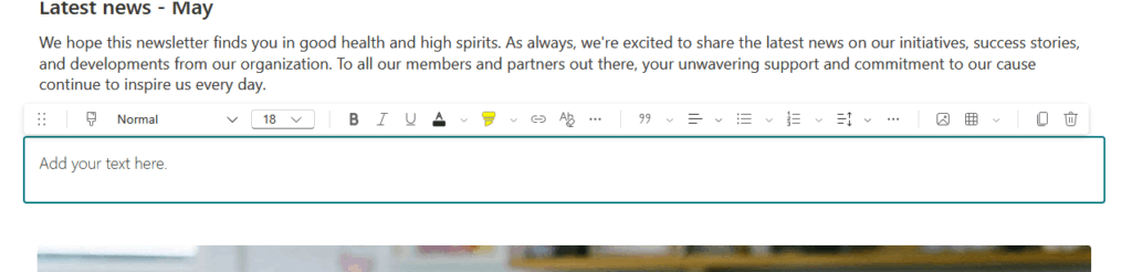
Reach for Text before anything fancier. Most of what looks like it needs a special web part is just formatted copy.
Divider and Spacer add clean visual breaks, and Button drops in a clickable link. Call to Action is the bolder version for the one thing you want clicked.
For News and Announcements
Hero is the big visual showcase at the top of a homepage, usually five spotlight tiles. Keep it to your most important links rather than stuffing every tile.
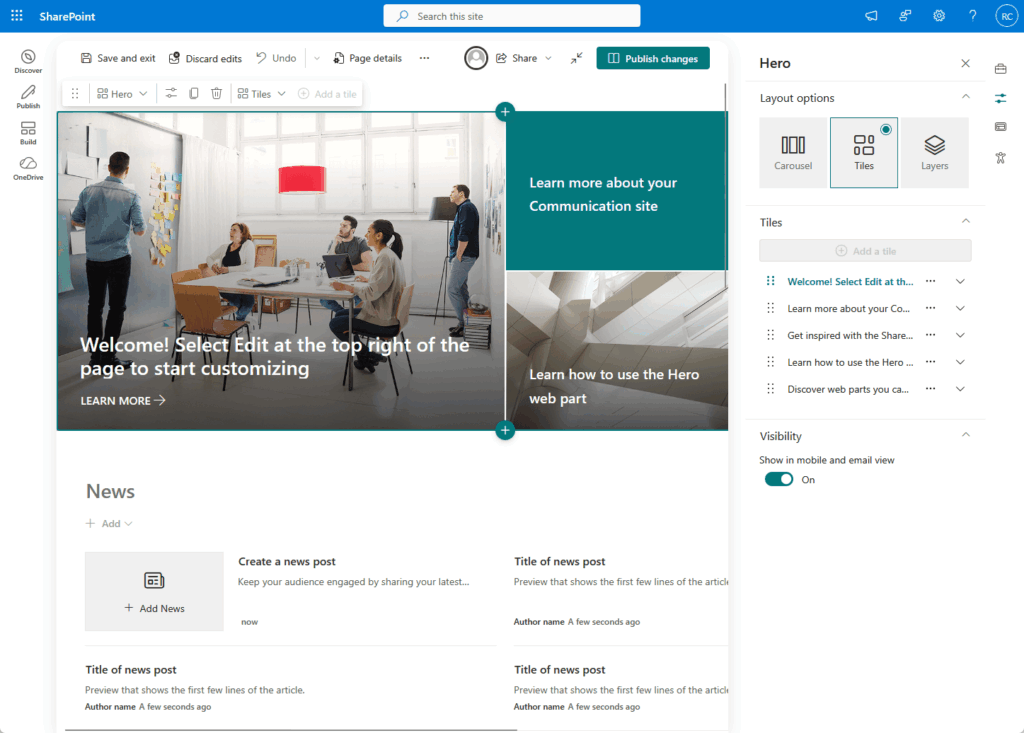
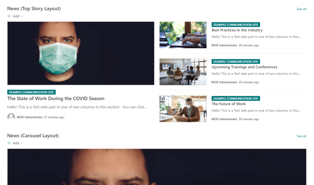
News rolls up your published news posts automatically, even pulling from across connected sites.
Quick Links gives you tidy navigational shortcuts, ideal for the tools people always ask for. Countdown Timer suits a launch date or event deadline.
For Documents and Files
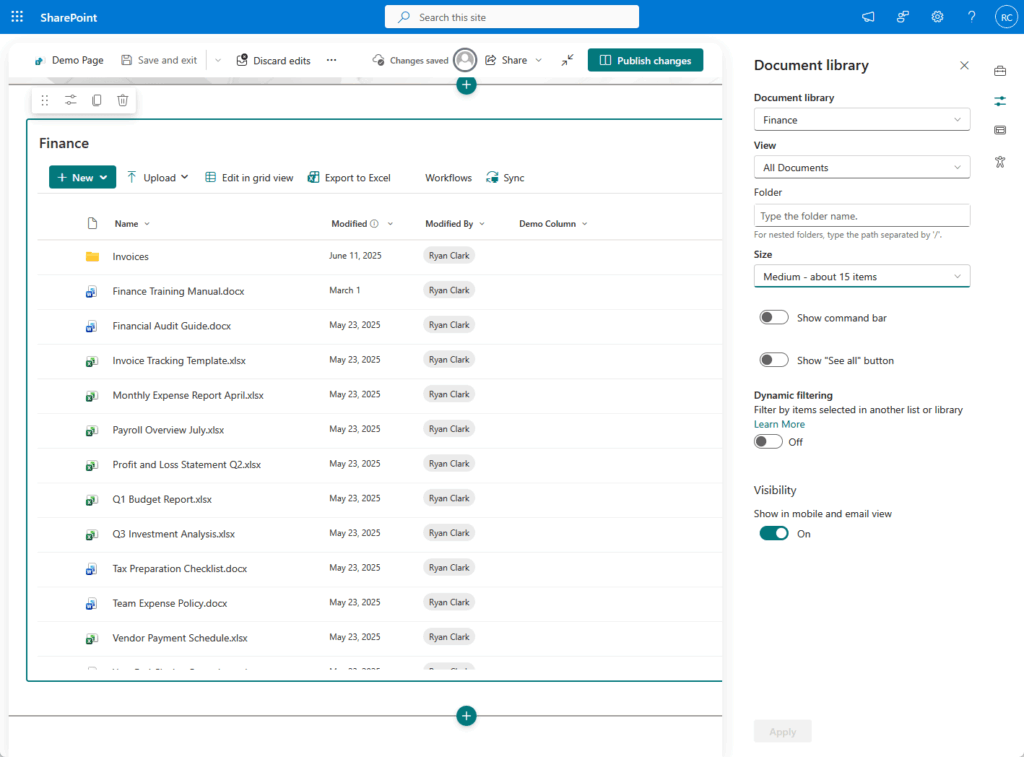
Document Library surfaces a live library right on the page. Point it at a specific folder or filtered view, so people see only what matters.
File and Media (formerly File Viewer) embeds a single file inline:
- A PDF
- A Word doc
- A video
That’s how you add video now, since Stream classic became Stream on SharePoint. List does the same for a SharePoint list, great for trackers, inventories, or structured data.
For People and Events
People shows profile cards for team members, which is handy for department or contact pages.
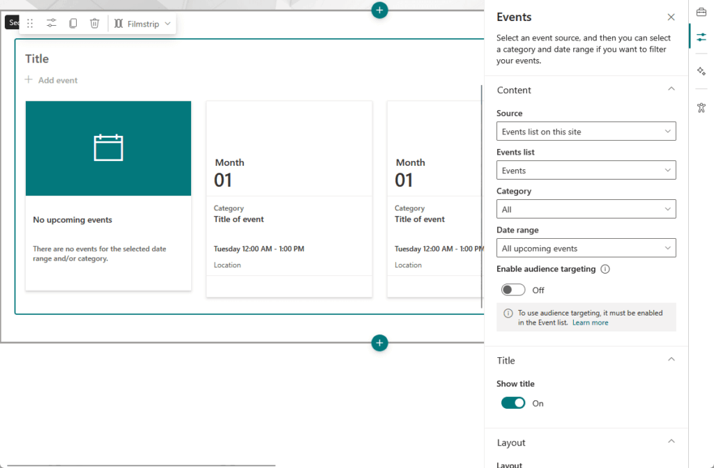
Events pulls from a calendar, Group Calendar shows a shared group schedule, and Organization Chart maps out reporting lines.
Viva Engage (the web part formerly called Yammer) drops a community feed onto the page. Use it when you want conversation, not just announcements.
For Data and Embeds
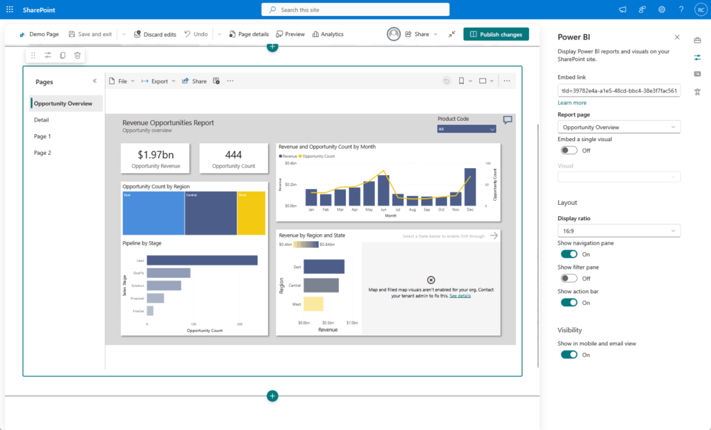
Power BI puts a live dashboard on the page for KPIs. Embed pulls in external content, and Forms surfaces a Microsoft Form for quick data collection.
There are handy extras too:
- Weather
- World Clock
- Maps (the old Bing Maps web part, now on Azure Maps)
Here’s a quick reference for the ones you’ll reach for most:
| Web Part | What It Does | Good For |
|---|---|---|
| Hero | Large visual spotlight tiles | Homepage top banners |
| News | Rolls up published news posts | Company announcements |
| Quick Links | Set of navigational shortcuts | Tools, forms, key pages |
| Highlighted Content | Auto-shows matching content by query | “Recently added” rollups |
| Document Library | Live library view on a page | Resource hubs |
| Power BI | Embedded live dashboard | KPI and reporting pages |
| Events | Upcoming calendar items | Team schedules |
| Embed | External content by URL or iframe | Third-party tools |
Microsoft keeps a solid example gallery and the SharePoint Look Book if you want to see these combined into full page designs.
Highlighted Content: The Powerful One That Trips People Up
If I had to name the single most misconfigured web part, it’s this one.
Highlighted Content is the dynamic rollup. It runs a query and automatically surfaces matching content instead of you hand-picking each item.
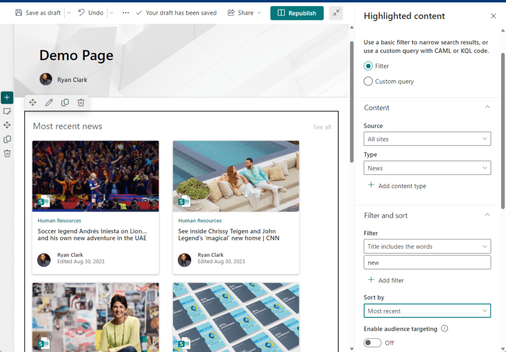
Set it up well and it’s magic.
A resource hub that always shows the ten most recently added documents, with zero manual upkeep. That’s the dream, and it’s very achievable.
Here’s what I keep seeing go wrong:
- Query scope. Too broad and you get noise, too narrow and the web part shows nothing at all. Both send people back to the settings, confused.
- Managed-property propagation. Tag content with a new column and it can take time to show up in search-driven results. People assume the web part is broken when it just hasn’t caught up yet.
- OR versus AND filter logic. It trips up almost everyone the first time. One returns too much, the other returns almost nothing.
Real talk: this web part rewards patience. Get the query right once and it maintains itself for years.
When Built-In Isn’t Enough: Custom Web Parts
Sometimes the out-of-box parts can’t do what you need. That’s when a developer builds a custom one using the SharePoint Framework, or SPFx.
It’s an extensibility model that tens of millions of users rely on every day.

Custom comes with governance built in, which I actually like:
- Every SPFx solution needs tenant-admin approval through the app catalog.
- There’s no public marketplace.
- An admin can disable a misbehaving one tenant-wide in seconds.
Custom isn’t cheap, though. A single custom web part means real developer time and testing, so it’s a proper budget line, not a quick tweak.
My advice? Exhaust the built-in options first.
Nine times out of ten, a well-configured Highlighted Content or Embed does what a client thought they needed custom code for.
Common Mistakes I See With Web Parts
A few patterns come up again and again when I audit a site:
- Page bloat. Piling on web parts until the page crawls. There’s no hard limit; the real ceiling is load time.
- Over-customizing. Reaching for custom code when configuration would have done the job for a fraction of the cost.
- Misconfigured queries. Mostly Highlighted Content, showing the wrong content or nothing at all.
On performance, there’s no magic number of web parts you’re allowed.
Microsoft’s guidance is load-time based, and its Page Diagnostics tool will flag the slow custom parts dragging a page down.
With 450 million-plus Microsoft 365 paid seats out there, a lot of people are learning these lessons the hard way. You don’t have to.
Start Simple, Then Build Up
The teams that get this right don’t start by maxing out every web part on the page. They start with a clear, simple homepage.
That first homepage usually needs just four web parts:
- Hero for the main visual
- News for company announcements
- Quick Links for key tools
- Events for what’s coming up
Clean, fast, and easy to maintain. From there you add only what earns its place, one page at a time.
A dashboard page gets Power BI or Embed for the KPIs. A resource hub gets a Document Library and a Highlighted Content rollup.
That’s how a modular intranet works. Every web part earns its spot, and nothing sits on the page just because it looked interesting in the Toolbox.
Get the structure right and the platform does the rest. That’s true whether you run one team site or a hundred.
Is your intranet a bloated mess of mismatched web parts nobody quite understands? I help IT teams and admins build clean intranets that actually work.
If that sounds like your situation, let’s fix it. Reach out and let’s talk.